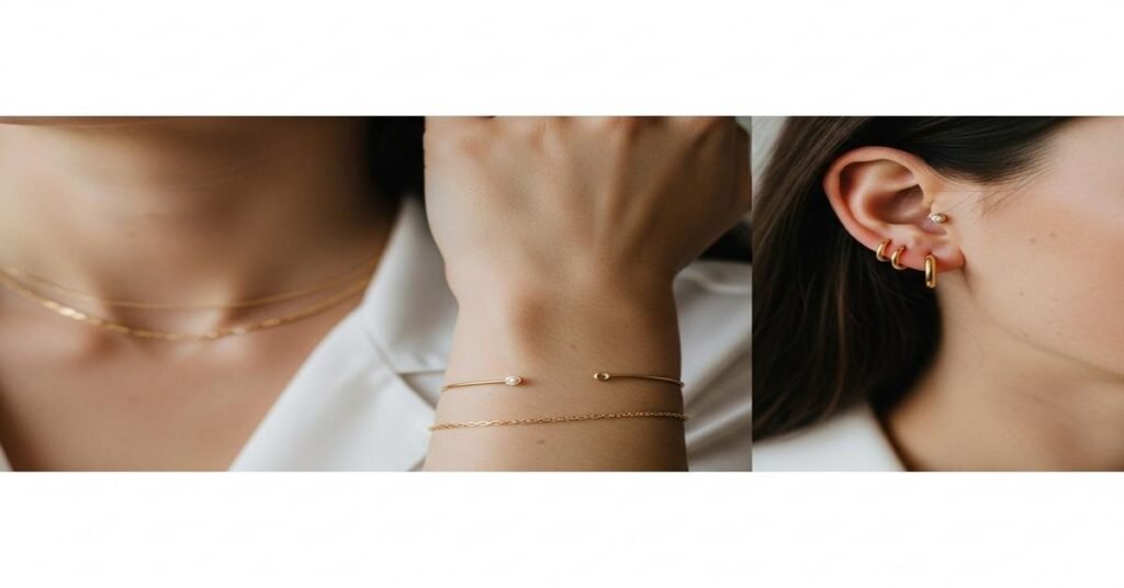
Where you place a piece of jewelry—neck, wrist, or ears—changes how people read it. Placement shifts scale, movement, contrast, and the visual context around the piece. A 1 ct diamond on the ear has a different presence than the same stone on a pendant or set into a bracelet. Below I explain the practical reasons for those differences, give clear examples with measurements and materials, and offer simple styling and care rules so you can choose placement with intent.
Why placement changes perceived effect
There are four practical reasons placement matters:
- Proximity to the face: The eye prioritizes the face. Jewelry near the eyes or mouth—earrings and short necklaces—reads as more important. That’s why a 0.5 ct (about 5 mm round) diamond stud looks significant on the ear, but the same 0.5 ct suspended at the sternum can appear smaller.
- Scale and distance: Visual scale depends on comparison objects. A 6.5 mm round (roughly 1 ct) looks large against the ear because it’s close to the face. The same stone on a long chain at 60–70 cm (24–28 in) sits against clothing and competes with the torso’s area, so it reads smaller.
- Movement and light: Ears and wrists move constantly and catch light. That creates more sparkle and perceived size. Necklaces, especially long or heavy ones that sit still, sparkle less aggressively unless designed to move (pendants or delicate chains).
- Context and contrast: Clothing, skin tone, and hair affect perception. A gold necklace on dark clothing pops more than on light clothing. Studs framed by short hair or an updo become focal points; long hair or a high collar can hide them.
Concrete examples that show the difference
- 1 ct round diamond (≈6.5 mm): On the ear as a stud, it reads bold and close to the face. On a 40 cm (16 in) chain as a pendant, it sits at the clavicle and still reads substantial. On a 60–70 cm (24–28 in) chain, that same stone appears much smaller because the torso area is larger and the chain might lie over patterned clothing.
- 0.25 ct stones (≈4.1 mm): As part of a tennis bracelet with 20 stones, they create continuous sparkle and read luxurious from a distance. One 0.25 ct stone on a wrist as a single bezel charm reads like an accent rather than the focal point.
- Drop earrings 30–50 mm: These elongate the face and catch light with movement. A 40 mm drop in 14k gold with a 7×5 mm pear-shaped top stone will draw the eye vertically, making neck and jawline appear longer.
Metal and alloy choices change perception, too
Alloy choice affects color, weight, and durability—factors that change how jewelry reads. 14k gold (about 58.5% gold) is harder than 18k (75% gold). A thicker 14k chain can be made finer and still support a pendant, so it looks delicate but is strong. Conversely, 18k pieces often look richer in color and can be cast with smoother surfaces, which reads as higher luxury on small items like studs or rings.
Examples:
- A 1.5 mm, 14k yellow-gold chain supports a 1 ct pendant without sagging and reads delicate because of its thin profile yet stays durable.
- White gold or platinum settings increase white gemstone brilliance by reflecting less warm color, making diamonds appear whiter—this matters most on earrings and rings because they sit near the face.
Styling rules that explain the “why”
- Balance the focal points: If you wear a heavy necklace (large pendant or broad collar), keep earrings small. Heavy necklaces already sit in a prominent position near the face; matching large earrings can compete and feel cluttered.
- Use contrast for clarity: A textured or colored chain looks bolder on bare skin or dark fabric. A small white diamond on light clothing can get lost—use darker settings or colored accent stones to increase contrast.
- Consider scale with body features: Short necks pair well with choker-length (35–40 cm / 14–16 in) pieces or short pendants that don’t drop below the clavicle. Long pendants elongate shorter torsos and can appear disproportionate.
- Layer intentionally: When stacking bracelets or necklaces, vary lengths and line weight. A thin 1.0 mm chain layered with a 1.8 mm chain reads deliberate. On the wrist, mix a tennis bracelet (0.05–0.10 ct stones each) with a plain bangle for texture without visual crowding.
Wear, comfort, and maintenance considerations
Placement affects wear-and-tear. Bracelets and rings contact surfaces constantly; they need tougher alloys or protective settings. For bracelets, choose secure clasps (box clasps with safety catches) and consider heavier links if you want longevity. Necklaces need proper soldering at closures—thin chains (≤1 mm) break easily if paired with heavy pendants. Earrings require appropriate post thickness (≈0.9–1.0 mm) and sturdy backs, especially for heavier drops to avoid stretched lobes.
Quick practical takeaways
- If you want maximum face attention: Choose earrings or short necklaces. A 0.5–1 ct stud or a pendant at 35–40 cm will read strong.
- For continuous luxury on the move: Opt for bracelets or tennis bracelets—small stones in series read expensive and sparkle in motion.
- If you want understated impact: Use a larger piece on the torso (2+ ct pendant) rather than matching the same weight on the ear. Distance softens perceived size.
- Match materials to wear: 14k for durability on frequently worn pieces; 18k or platinum for richer color and small pieces near the face.
Placement changes perceived effect because the body isn’t a neutral stage—it’s an active frame that moves, has shape, and interacts with clothing and light. Choosing where to wear a piece is as important as choosing the piece itself. Think about proximity to the face, movement, scale against clothing, and durability needs, and you’ll pick the placement that achieves the look you want.
I am G S Sachin, a gemologist with a Diploma in Polished Diamond Grading from KGK Academy, Jaipur. I love writing about jewelry, gems, and diamonds, and I share simple, honest reviews and easy buying tips on JewellersReviews.com to help you choose pieces you’ll love with confidence.