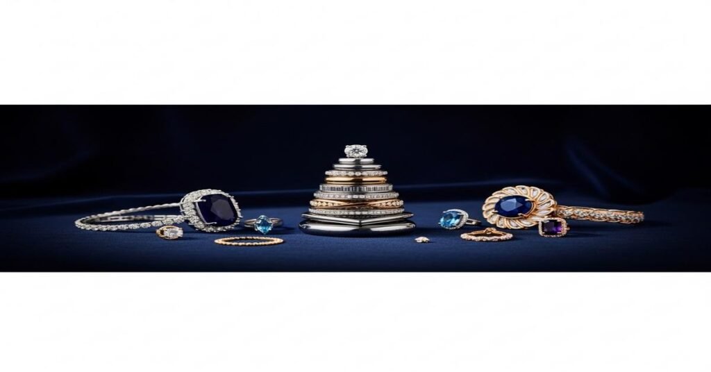
Building a “cosmic stack” means layering rings, bracelets and necklaces with a celestial feel—moons, stars, hammered textures, and tiny pavé diamonds—so the whole look reads as intentional and luxe. The trick is not more pieces, but the right pieces and the right proportions. Every choice should answer a practical why: why a certain width, why a certain metal, why that spacing. Below I show you how to plan, mix, and wear a stack that looks curated, balanced, and valuable.
Start with an anchor piece. The anchor defines scale and story. It can be a 0.50 ct center stone ring (about 5.0–5.1 mm round) with a bezel moon engraving, or a 12 mm pendant of mother-of-pearl on an 18″ chain. Choose one piece with the strongest visual weight. Why? The eye needs a reference point to decide where to rest. Without it, a stack looks busy rather than luxurious.
Choose a clear palette: metal and color. Limit your stack to one dominant metal and one accent metal. Example: 14k yellow gold as dominant and white gold as a small accent. Why limit colors? A narrow palette reads richer. Practical notes: 14k gold is 58.3% pure gold and harder than 18k, so it resists wear for rings and bracelets. 18k (75% gold) has a warmer hue but scratches more easily. For white metals, pick rhodium-plated white gold or platinum for durability. Vermeil (≥2.5 μm gold over sterling silver) is a good budget luxury option but avoid heavy everyday wear—plating wears over time.
Layer by scale: big, medium, small. Arrange pieces in descending scale around the anchor. For a ring stack: start with a statement band (4–6 mm wide or a 0.50–0.75 ct center), add two medium bands (2–3 mm), and finish with one or two tiny accent bands (1–1.5 mm or pavé rows with 0.01–0.03 ct melee). Why scale down? Larger to smaller creates visual flow and prevents the stack from feeling top-heavy.
Think texture, not just shine. Mix finishes—polished, matte, hammered, pavé—so pieces don’t compete. Example: pair a polished dome band (3.5 mm) with a hammered slim band (1.5 mm) and a pavé eternity band (1.8 mm). The hammered texture catches light differently than pavé, which makes each piece readable. Why textures? Lux looks layered, not flat.
Use repetition to create rhythm. Repeat a shape or motif twice across the stack. If your anchor is a crescent pendant, add a tiny crescent charm on a bracelet or a crescent pavé accent on a ring. Why repeat? Your eye recognizes pattern and interprets the stack as deliberate design rather than random mixing.
Respect negative space. Leave small gaps. Don’t push every piece right next to the anchor. For ring stacks, give 1–2 mm between larger rings and 0–1 mm between slim bands that are meant to sit flush. For necklaces, place the longest chain at 18–20″ and add a 16″ choker or 14″ short chain; allow 1–2″ difference between layers so each pendant has its own breathing room. Why? Negative space prevents visual clutter and elevates the perception of each item.
Fit and comfort matter technically. Rings: if you stack three or more bands, size up 0.25–0.50 if your fingers swell. Wider stacks (total stack >6 mm height) may need a half-size increase. Band profiles: comfort-fit interiors (rounded inside) glide on easier. Bracelets: add 0.5–1.0 inch to your wrist measurement for a layered look that still moves. Chains: choose chain thickness to match scale—1.0–1.2 mm for delicate pendants, 2.0–3.5 mm for heavier anchors.
Gemstone choices: tone down or pop intentionally. For a celestial stack, pick one colored stone as a focal pop—sapphire (0.20–0.50 ct), moonstone cabochon (6–10 mm), or opal slice (6–12 mm). Surround it with small white melee diamonds (0.01–0.02 ct each) for brightness. Why one color? Too many colors reduce cohesion. A single, well-placed color reads as curated and expensive.
Mix metals with rules, not randomness. If you want mixed metal, follow a dominant/anchor rule: 70% dominant metal, 30% accent. Use the accent in small, repeated doses: an accent chain clasp, a narrow side band, or pavé settings in white gold against a yellow gold anchor. Why? This proportion keeps the look intentional rather than clashing.
- Step-by-step build
- Choose your anchor (statement ring or pendant).
- Add one big supporting piece (dome band or cuff bracelet).
- Add two medium texture pieces (hammered, rope, or chain links).
- Add one or two slim pavé or plain bands for sparkle and finish.
- Stand back and remove one piece if it looks crowded.
Practical shopping specs. For rings, think in millimeters: 4–6 mm for statement, 2–3 mm for comfortable mid bands, 1–1.5 mm for accents. For diamonds, 0.01–0.03 ct melee are common for pavé; a 0.50 ct center reads classic and wearable. For chains, pick 1.0–1.2 mm for delicate, 1.8–3.0 mm for anchor chains. For bracelets, 1.5 mm chains layer well; a cuff of 3–5 mm gives a luxe anchor.
Care and longevity tips. Avoid chlorine and heavy chemicals; they damage alloys and stones. Clean weekly if you wear a stack daily: warm water, mild detergent, and a soft brush for pavé. Refinish plated pieces when wear shows; vermeil and gold-filled pieces may need replating over time. Store stacked pieces flat or in individual slots to prevent scratching. Why care? Proper maintenance preserves finish, which is what makes a stack look luxe over time.
Build a cosmic stack with intention. Start with scale, pick a clear palette, vary texture, and leave breathing room. When every piece has a reason to be there, the whole look reads as sophisticated and expensive, even if some items are modest in carat or price.
I am G S Sachin, a gemologist with a Diploma in Polished Diamond Grading from KGK Academy, Jaipur. I love writing about jewelry, gems, and diamonds, and I share simple, honest reviews and easy buying tips on JewellersReviews.com to help you choose pieces you’ll love with confidence.