Engraving Fonts: Why Some Wear Off Faster Than Others
Engravings on jewelry look permanent, but some lettering fades long before the piece does. The main reasons are the font’s shape, the engraving depth and width, the metal’s properties, and how the piece is worn and finished. Knowing the mechanics behind these factors helps you choose a font and technique that will last.
How engraving actually works
Engraving removes or displaces metal to create a groove that forms letters. That groove has three measurable factors that determine durability: depth (how far into the metal, measured in mm), stroke width (how wide the carved line is, in mm), and the shape of the cut (V-shaped, U-shaped, or a shallow surface mark). Deeper and wider cuts hold up better under wear because there is more metal left before the letter disappears.
Why font shapes matter
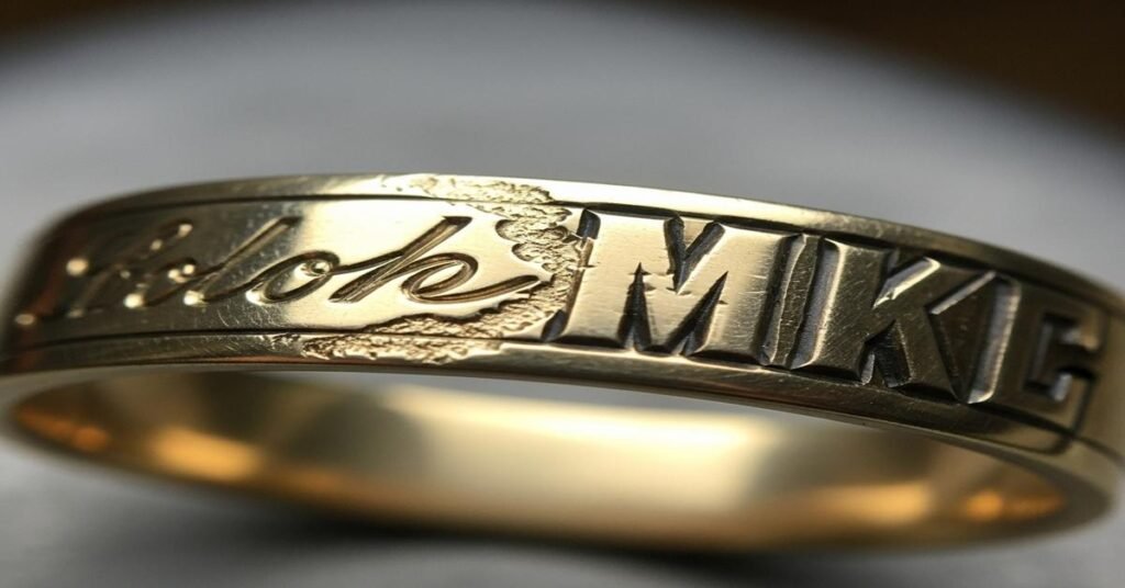
Fonts are not just a style choice. Each font creates different stroke widths, terminal shapes, joins and counters (the enclosed areas in letters like “o” or “e”). Those features affect how much metal remains after years of rubbing, polishing or contact with chemicals.
- Thin strokes wear fastest. Fonts with hairlines or very thin vertical or horizontal strokes (script, delicate serif faces) have less metal depth to start with. A 0.1 mm laser mark on a hairline loses legibility far quicker than a 0.5 mm carved block letter.
- High-contrast faces create weak points. Fonts that switch between thick and thin strokes (high-contrast serifs) concentrate wear at the thin parts and at sharp joins. Those thin joins smooth out with even a small amount of abrasion.
- Small capitals and low x-height fade. Tiny letterforms with low x-height (short body size relative to caps) provide less metal to protect the shape. On rings, letters under ~2 mm tall are vulnerable.
- Ornament and script are fragile. Loops, flourishes and fine terminals catch on things and have narrow cross-sections. They abrade or break quickly compared with simple, geometric letters.
- Closed counters resist better. Solid, blocky letters (e.g., capital O, D, or M in a bold sans) keep form longer because the internal space supports the outer edges.
Numbers that matter — practical guidelines
- Minimum depth: For long-lasting engraving on rings, aim for 0.25–0.50 mm depth for mechanical engraving. Laser engraving can be 0.02–0.20 mm; the shallow end will fade sooner. For everyday rings, 0.30 mm is a safe target if you want durability.
- Minimum stroke width: Keep strokes at least 0.5 mm wide for inside-band engraving. Thin strokes under 0.3 mm will round off with normal wear or polishing.
- Minimum letter height: On curved surfaces like rings, characters should generally be at least 2.0–3.0 mm tall for good legibility over time. Pendants and flat tags can be smaller because they see less abrasion.
Metal choice and finish
The metal and surface finish change how quickly a font wears away.
- Gold alloys: Higher karat gold is softer. 18k (75% Au) is softer than 14k (58.3% Au). That means an engraved 14k ring holds detail longer than an 18k ring at the same depth. Rose and white gold alloys differ in hardness depending on the non-gold metals used.
- Platinum: Commonly 950 Pt (95% platinum). It’s ductile and tends to displace rather than remove metal when scratched. Engraving in platinum can stay legible because the metal redistributes, but shallow cuts still round off under heavy wear.
- Stainless steel and titanium: Much harder. Engraving can be deep and crisp and will usually outlast precious metals under abrasion. But they’re harder to engrave deeply with manual tools.
- Plating and coatings: Rhodium plating or PVD coatings can mask an engraving if the plating layer is comparable to engraving depth. If you engrave after plating, the finish may flake or wear differently. If you engrave before plating, thin letters can be filled in by the plating.
- Polish vs satin: Bright polish shows scratching quickly; satin finishes hide small wear but reduce contrast. A polished surface will reflect light into the engraved groove and can make shallow marks look less visible after a bit of wear.
Position, curvature and wear direction
Where the engraving is placed affects longevity. The outside of a ring or the edge of a pendant faces direct abrasion. Inside bands are more protected. Curved surfaces reduce effective depth at the edges: a 0.3 mm cut on the crown of a curve becomes shallower at the sides. Also consider how the metal typically contacts other surfaces: wedding rings get friction from handshakes, keys, or keyboards. That consistent directional wear will first erode the leading edges of letters.
Engraving methods and their effects
- Hand engraving: Cuts are typically deeper (0.25–0.6 mm) and have crisp, V-shaped profiles. The human engraving tool can create undercuts that catch light and stay readable longer. Best for heirlooms and deep personalization.
- Rotary/machined engraving: Precise, repeatable, and common for consistent depths (0.15–0.4 mm). Good for block fonts and monograms that need durability.
- Laser engraving: Fast and fine, but usually shallow (20–200 µm). Laser is great for high detail or blackened contrast but less durable unless the depth is increased or the piece isn’t subject to heavy abrasion.
- Fill techniques: Enamel, lacquer or PVD fills boost contrast, but the fill can wear away faster than the groove. Deep cuts with durable fills are the most long-lasting combination.
Practical font choices
- Best for durability: Bold geometric sans (block capitals) with uniform stroke width. These use more metal and tolerate shallow cuts better.
- Acceptable if deep: Slab serifs or low-contrast serif faces with sturdy serifs (only if cut deep and wide enough).
- Avoid for everyday wear: Script, very thin modern serifs, and decorative faces with fine terminals or extreme contrast.
What to ask your jeweler
- How deep will you cut (mm)? Ask for at least 0.25–0.30 mm for an inside ring that will last.
- What is the minimum stroke width? Insist on ≥0.5 mm for small rings.
- Will you engrave before or after plating? If after, expect the plate to alter edges; if before, ask about fill or contrast methods.
- Can you show a sample on the same metal and finish? Seeing a mockup shows real legibility and wear potential.
Takeaway
Fonts wear differently because of their shapes, the engraving depth and width, the metal’s hardness, and where the engraving sits on the piece. If you want longevity, choose simple, bold letterforms; specify deeper, wider cuts; pick harder alloys or protected locations; and match the engraving method to the wear you expect. These steps preserve details and keep the inscription readable for decades.
I am G S Sachin, a gemologist with a Diploma in Polished Diamond Grading from KGK Academy, Jaipur. I love writing about jewelry, gems, and diamonds, and I share simple, honest reviews and easy buying tips on JewellersReviews.com to help you choose pieces you’ll love with confidence.