Most diamond buyers spend too much on color. The D–Z color scale makes it feel like “D” is perfection, so it must be the best. In reality, D color is a premium you almost never see once the diamond is mounted and sparkling in normal light. If you want the whitest-looking diamond for the least money, you should aim lower on the scale and use setting, shape, and cut to your advantage. This guide explains how color is graded, how we actually perceive it, and exactly where to save without sacrificing beauty.
How the D–Z color scale works
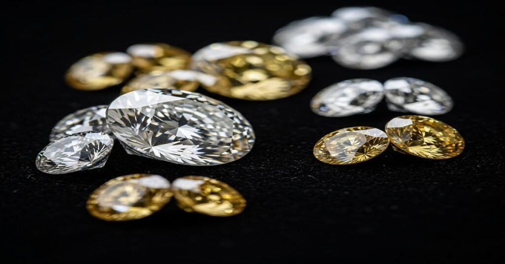
Diamonds are graded from D (colorless) to Z (light yellow/brown). The major groups are:
- D–F: Colorless
- G–J: Near colorless
- K–M: Faint color
- N–R: Very light color
- S–Z: Light color
Here’s the catch: color grades are assigned face-down under standardized daylight-equivalent lighting against master stones. You never wear a diamond face-down. Face-up, the diamond’s cut returns light that masks body color. That’s why a well-cut H round often looks as white as an F to most eyes once set.
Another important point: the color scale isn’t “visual distance.” The jump from D to F is tiny to the eye. The price jump isn’t tiny. You pay a large premium for a difference that’s hard to see in real life.
Why “D” color is a bad value
- You pay for invisibility. D is prized because it’s the top grade on paper. Face-up, a D doesn’t look meaningfully whiter than an E, F, or often even a well-cut G in platinum or white gold. The human eye isn’t good at seeing such small temperature shifts once brilliance and fire dominate.
- Color is graded where you don’t see it. The face-down method finds trace body color that gets masked by light return. The grade signals rarity, not visible beauty.
- Diminishing returns. Each step higher on the color scale costs more, but the visible improvement shrinks. You can usually redirect that budget to better cut or more carat weight—both you’ll notice every day.
- Cut trumps color. A D with mediocre cut looks dull; an H with top-tier cut looks bright and lively, which reads “whiter.” Light performance beats paper specs.
- Resale reality. Retail buyers pay big premiums for D color; secondary markets don’t reward it as much. That “investment” often doesn’t pay you back.
The sweet spot by metal color and shape
Color shows differently depending on the setting and faceting style. Use that to save money without losing a white look.
- White gold or platinum, round brilliant: Aim H–I for most sizes. If you’re color-sensitive or going 2 ct+, G–H. Rounds hide color best because their cut pattern is all sparkle.
- Yellow or rose gold, round brilliant: J–K (even L in some designs) looks great. The warm metal makes everything read warmer, so higher color brings no visible benefit.
- Ovals, pears, marquise: These show more color at the tips and in the bow-tie. Target G–H in white metal, I–J in yellow/rose.
- Cushion brilliant and radiant: These hide color well face-up. I–J in white metal, J–K (even L) in yellow/rose can look white.
- Emerald and Asscher (step cuts): Step cuts are like windows; they reveal body color and inclusions easily. In white metal, stick to F–H (I if smaller and well-cut). In yellow/rose gold, G–J works.
- Halo settings: The melee around the center is often higher color. That contrast can make a lower-color center look slightly warmer. If the halo stones are very white (F–G), keep the center within 2–3 grades for a cohesive look.
Carat weight and cut: how they change color perception
Bigger diamonds show more color. As carat weight increases, the pavilion is deeper and you’re looking through more material. A 3 ct I will show more warmth than a 0.9 ct I. Bump your target color up a notch as size increases:
- Under 1 ct: I–J works well (brilliants), G–H for step cuts.
- 1–2 ct: H–I for brilliants; F–H for step cuts.
- 2–3 ct: G–H for brilliants; F–G for step cuts.
- 3 ct+: Consider moving one grade higher if you’re color-sensitive.
Cut quality “whitens” the look. Excellent light return makes a diamond appear brighter and whiter because your eye reads sparkle first. Prioritize proven proportions and symmetry over color grade creep.
Fluorescence: friend or foe?
Blue fluorescence can make a slightly tinted diamond (I–M) look whiter in sunlight because blue cancels yellow. It also often lowers the price because some buyers avoid it on principle.
- When it helps: Medium to strong blue in I–K stones can be a smart buy that looks a grade whiter in daylight.
- When to be careful: A tiny fraction show “milkiness” or haziness in bright light, usually in strong fluorescence. View the diamond in direct sunlight and office light. If it looks clear and lively, you’re good.
How labs grade color—and why that misleads shoppers
Labs grade loose stones face-down against master stones under controlled lighting. This standardization is good for consistency, but it doesn’t reflect real-world viewing. Face-up in a ring, your eye sees brilliance, fire, contrast, and metal color—all of which reduce perceived tint.
Also remember that grading has tolerances. A stone at the strong end of G can look like an F. Don’t overpay for the letter; judge with your eyes in the setting you plan to wear.
Practical buying strategy: step by step
- Choose shape and metal first. These two choices determine how much color you’ll see.
- Set a color target range, not a single grade. For example: “H–I for a round in platinum.” This keeps options open and prices down.
- Prioritize cut. Shortlist stones with top light performance. A high-performing H beats a dull F every time.
- View loose and face-up. Ask to see stones side-by-side on a white tray, then on the hand. Step back 12–18 inches—the distance people actually see your ring.
- Check different lighting. Daylight near a window, office LEDs, and warm indoor light. Tint appears differently across environments.
- Consider fluorescence. If the stone is clear and lively, medium/strong blue can be a price and appearance win in the I–K range.
- Match to the setting. If you’re using a warm metal or a closed gallery, you can accept more warmth. If you’re going platinum, high-polish, and very open, stay a notch higher.
- Balance clarity realistically. Choose “eye-clean” over high letters. An SI1 that looks clean to your eye lets you afford a better cut or size without paying for invisible clarity.
Examples: how to save real money on color
- 1.5 ct round in platinum: Dropping from F to H usually frees a meaningful budget chunk without a visible change face-up if cut is excellent. Spend the savings on superior cut quality or a slightly larger carat.
- 2 ct oval in yellow gold: J–K often looks white once set because the metal and elongated shape mask warmth. Going from G to J typically saves a large percentage while looking nearly identical on the hand.
- 3 ct emerald cut in platinum: Step cuts show color. Instead of D, target G–H with top clarity and cut. You’ll keep a white look, avoid the huge D premium, and get a more impressive overall stone.
Common myths about diamond color
- “Higher color always looks better.” Not if cut is weaker or the stone is set in warm metal. Brightness beats the letter grade.
- “Color is graded face-up.” It’s not. That’s why the letter doesn’t predict what you’ll actually see on the hand.
- “Fluorescence is bad.” Most fluorescent diamonds look perfectly fine. In the right color range, it’s an advantage.
- “Yellow gold needs high color.” The opposite. Yellow or rose gold hides warmth; use it to save money.
- “People can spot a two-grade difference across a table.” In real life viewing, most can’t—especially in brilliant cuts.
When a D color might make sense (rarely)
- Symbolic or collector reasons. You want the rarest grade for personal satisfaction, regardless of value.
- Very large, high-clarity step cuts in platinum for a color-sensitive wearer. Even then, E–F typically looks identical face-up. Choose D only if the premium genuinely matters to you.
Quick reference recommendations
- Round brilliant, white metal: H–I (G–H if 2 ct+ or color-sensitive)
- Round brilliant, yellow/rose gold: J–K (L possible with closed or vintage settings)
- Oval/pear/marquise, white metal: G–H (I in smaller sizes)
- Oval/pear/marquise, yellow/rose gold: I–J
- Cushion brilliant/radiant: I–J in white metal, J–K in warm metals
- Emerald/Asscher: F–H in white metal, G–J in warm metals
- Fluorescence: Consider medium/strong blue for I–K stones if the diamond is not hazy
Final thoughts
Don’t buy a D color diamond—buy a diamond that looks white to you once it’s on the hand. The D premium pays for a lab letter, not a visible upgrade. Use the setting metal, shape, carat, and especially cut to manage how color appears. For most buyers, the best value lives in the G–J range for brilliants and F–H for step cuts, adjusted for size and metal. Follow the step-by-step process, judge in real lighting, and put your money where it shows.
I am Satyam Pandey, a gemologist with a Diploma in Polished Diamond Grading from KGK Academy, Jaipur. I love writing about jewelry, gems, and diamonds, and I share simple, honest reviews and easy buying tips on JewellersReviews.com to help you choose pieces you’ll love with confidence.