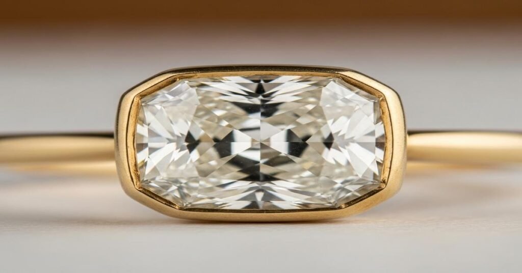
Antique Cuts 101: Why Old-Mine Cushion Faces Up “Chunky”—And Looks Bigger
The old-mine cushion is one of the most recognizable antique diamond shapes. When you look at one, it often appears thicker, heavier and more solid than a modern cut of the same carat weight. That “chunky” face-up look comes from four practical factors: proportions, facet size and layout, culet and girdle, and the way weight is distributed in the stone. Below I explain each factor, give typical ranges, and show how those details translate to what you actually see in a ring.
1. Proportions: crown height, table size and depth
Old-mine cushions typically have a relatively high crown and a smaller table than modern cushions or round brilliants. A higher crown means the top part of the diamond projects more above the girdle. A small table (often noticeably smaller than modern table percentages) exposes more of the crown facets. The result: large, broad crown facets that create chunky flashes of light instead of many tiny sparkles.
Practical numbers (typical ranges, not absolutes):
- Table: Old-mine cushions often show smaller tables—think roughly 30–45% of the width—versus modern brilliants that use 53–58% tables. A smaller table concentrates visual interest into the large crown facets.
- Crown height/angle: Antique crowns are frequently taller. Crown angles might be in the 35–45° area, producing a taller profile and chunkier face-up look.
- Depth: Depth percentages vary, but antique cushions can have a slightly different depth distribution—more weight in the crown and girdle—affecting face-up spread (see below).
Why this matters: Big crown facets and a small table produce broad light-dark areas. Your eye reads those as mass and solidity. Large flashes look like a single, chunky plate of light rather than a disco of tiny sparks.
2. Faceting style: fewer, larger facets
Antique cuts were hand-faceted. Cutters used larger facets and fewer precise divisions than machine-assisted modern cuts. An old-mine cushion will show broad facet planes that make pronounced light-and-dark patterning. Modern cuts divide those planes into many small facets to increase scintillation and dispersion; antique facets favor larger flashes.
Example: A modern cushion brilliant might have dozens of small star and kite facets across the crown to create scintillation. An old-mine cushion commonly shows larger kite and star facets with simpler pavilion faceting. That simplification reduces micro-sparkle and increases macro-flash.
Why this matters: Large facets make the stone “read” as larger because they give clear, bold reflections. Your eye attributes volume to those broad reflections.
3. Visible culet and rounded profile
Old-mine cushions almost always have a noticeable culet (the flattened tip at the pavilion). Modern brilliants either have a tiny or no culet. The visible culet adds to the face-up visual center—the stone looks centrally weighted. Also, antique cushions have a squarer, pillowy outline with rounded corners. That reduced negative space relative to a narrow, pointed cushion means more material appears across the face.
Practical example: Two 1.00 ct stones—an old-mine cushion and a modern round—can present very different face-up presences. A modern 1.00 ct round brilliant averages about 6.5 mm in diameter. An old-mine cushion of the same weight often measures in a similar or slightly larger face-up dimension (for many vintage proportions you might see 6.6–7.1 mm), but it looks thicker because of crown height, culet visibility and facet size.
4. Weight distribution and spread
The final reason antique cushions “look bigger” is how the weight is distributed. Spread (the face-up mm for a given carat) depends on how deep the pavilion is relative to the diameter. If a cutter concentrates weight into the crown and girdle—common in older cutting styles—the pavilion can be shallower and the stone will sit a bit wider for the same carat weight. That increases perceived size.
Measure for yourself: always ask for length, width and depth in mm and the depth percentage. Depth percentage = (depth ÷ average diameter) × 100. A lower depth percentage tends to correlate with a wider face-up spread. But because old-mine proportions include a tall crown, the depth number alone won’t tell the whole story. Look at the mm across the top.
How this shows up in jewelry
- In a bezel setting, an old-mine cushion looks especially solid because the bezel edge follows the rounded outline. The chunkiness isn’t visually broken up by open prongs.
- In prong settings, thin prongs reveal more of the face and make the stone look larger. Thick prongs or a heavy gallery can reduce perceived size.
- Metal color and contrast matter. A yellow-gold setting can warm an antique diamond’s face and make the center appear fuller. A white-metal setting emphasizes fire and contrast differently.
Buying and evaluating tips
- Ask for exact measurements: length × width × depth in mm, plus table % and any crown/pavilion angle info. Compare actual mm to known mm-per-carat examples (e.g., a 1 ct round ≈ 6.5 mm) to judge spread.
- Look at photos and videos: Large facets show big flashes in video. If a stone looks like broad, steady flashes instead of a lot of pinpoint sparkle, you’re seeing that chunky antique effect.
- Consider setting style: Bezel and low-profile settings emphasize mass. Prongs and airy settings emphasize visual diameter.
- Expect variations: Antique cuts were hand-cut. Two old-mine cushions of the same carat can look different. The “chunk” factor is a mix of proportions and hand-finished faceting.
Bottom line: Old-mine cushions look chunkier because of their high crowns, smaller tables, visible culets, simpler large facets, and how weight is distributed. Those design choices create bold, broad light returns and a rounded profile that reads as larger and more substantial than many modern cuts of the same weight. If you like a solid, vintage look—big flashes instead of glitter—you’ll likely prefer the old-mine cushion’s chunky face-up personality.
I am G S Sachin, a gemologist with a Diploma in Polished Diamond Grading from KGK Academy, Jaipur. I love writing about jewelry, gems, and diamonds, and I share simple, honest reviews and easy buying tips on JewellersReviews.com to help you choose pieces you’ll love with confidence.